BIRKIES REBRAND
A conceptual rebrand of Birkenstock to "Birkies," targeting a youthful, trend-conscious audience.


MARKET RESEARCH & INSIGHTS
Analyzed branding trends in the footwear industry - Birkenstock
Identified key Gen Z & Millennial purchasing behaviors.
Established the need for a casual, friendly, and socially engaging brand identity. created a conceptualise design board of the current birkenstock to understand its store.
After conducting market research on the current brand, we identified key areas for rebranding opportunities. Our main focus was on children aged 7-14, incorporating abstract and fun colors—something not commonly seen in Birkenstock. This led us to develop a new brand identity and conceptual board for ‘Birkies'.

Analysing how customers would experience within the store and thus created a visual journey map

KIT OF PARTS OF POP UP STORE, BIRKIES


DISPLAY FIXTURE
shoes will be displayed on this fixture. This display is interactive.
Design Function
Each individual designed a functional fixture that could be easily assembled and disassembled while maintaining cohesiveness with the store’s theme.
Assembling and dissembling


Technical Drawings
UI / UX

Design Concept
Menu page
Desing concepts of games
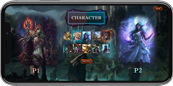
Character Menu

Design Concept
Friend list page of a Marvel Game
Design Concept
Character Selection of Marvel game


Design Concept
Map Selection
Design Concept
Fight Menu

.png)
.png)
.png)
.png)


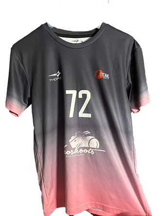
JERSEY DESIGNS